March 17, 2016
Client Profile: Kimmies Coffee Cup
Kimmie’s Coffee Cup is a popular brunch spot in the north Orange County area. With the 6th location just opening shy of December 2013, it’s no doubt that this breakfast cafe had a large fan base and needed to be reached.
Kim and her girls had approached us and expressed their interest in redesigning their website. Their old one was outdated and absolutely had no control over it. Visiting several locations, I got a better “feel” or “vibe” of their restaurants and implemented my design force with it.
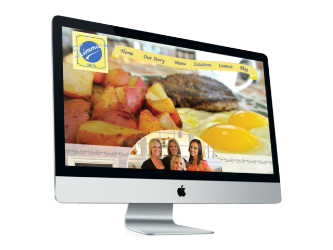
Their color base is yellow with a simple French Script font found in all their menus. The challenge of the entire design was to incorporate that “home” “cottage” “cozy” feel but at the same time keep it modern and up to date. Having the design be a unique layout (you know, not that cookie cutter box layout) was also a big factor that had to be considered. We went ahead and incorporated a yellow ribbon banner on top as the navigation bar which is conveyed that feminine look but also kept the entire look together.
On the home page, we needed to incorporate a family picture to convey that this was a family run business. The background are large photos of their food which also acts as a slider.
So modern, crafty, cute, feminine and clean, we were able to successful met the clients needs as well as achieve our goal to keep the look consistent, and user interface easy to navigate.
Visit Kimmiescoffeecup.com