January 28, 2016
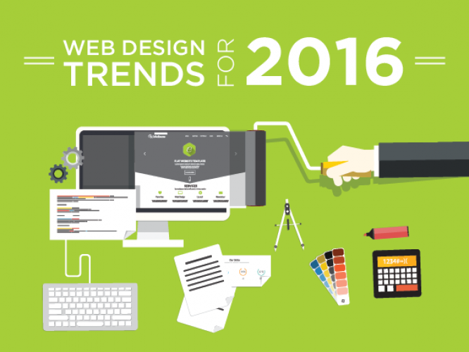
Website Trends That Will Continue In 2016
Happy New Year from our Orange County Web Design Company to yours! 2015 was a big year for website design and the trends this year will be sticking around in 2016. Our Web Design Company Orange County is fully prepared for anything to come this year.
“Aesthetic usability doesn’t have to be an oxymoron.” –Jay Chang Web Developer
Our Orange County web design experts have noticed trends on a large scale and small scale that will continue into 2016. We will begin with small scale. As a Orange County Digital Marketing Agency we want to keep you prepared for the trends that will continue to be in the year 2016. Here is what our experts at the Digital Marketing Agency Orange County had to say…
Small Scale:
Ghost Buttons
Ghost buttons are exactly what they sound like. The part that the users usually click on in a traditional button is made transparent. They are typically square, rectangle or circle and best used with a flat user interface or with a large scale video or photo. These buttons are usually placed in a dominant location like the center and are usually larger than the average button. These buttons portray a clean look and feel. You can see them featured on our website.
Enhanced Typography
Typography can now be more. The typography can express individuality and make the website come alive. There are more creative fonts that have come along since the standard few that were created, thanks to CSS. They have created features that include the ability to scale, measure font and leading for a more pleasing visual.
Scroll First & Click Second.
To think it was a clicking world till we found out scrolling is easier. Users have become more accustomed to scrolling versus clicking. It takes longer to click and load multiple pages than to scroll and view one page. Making the website scrollable makes it easier for the user and lets the designers spread out information. If you look at this school website design, you will notice a very similar style. Everything is scrollable and makes the interface easy to use. This remains the same even if it is a website design for schools.
Flexbox
Though the spec was originally released in 2009, increasing browser support has seen this CSS technique establish itself as an invaluable tool in the modern front end developer’s toolbox. Flexbox provides new, flexible layout possibilities and resolves much of the frustrating limitations of the traditional floating div layouts. With Microsoft finally jumping on the bandwagon with IE10 support, developers can finally unleash this CSS mode to create the new, flexible and innovative website designs we expect to see in 2016.
Large Scale:
Grid Based Layouts
Grids are used to help guide the eye on the webpage. The Information lay out on as if there was an X and Y axis. Visually this is the basic visual trends for website design. They create order in the website by dividing the content into manageable sectors. This makes the content easier to view and understand for the users. The main objective is to get the message across in an original and effortless as possible.
Backgrounds:
Full Screen Photo
Photos are being used as a complete full screen. They are lively and real versus the generic stock photos. They show people using the product in a real life situation. Photos can be on a carousel or one picture.
Full Screen Video
We mentioned background videos and large photos during ghost buttons. Videos that are playing on the home screen background are creating some serious buzz. These videos can be clips that represent your company culture or can simply create the atmosphere for the website.
Cinemagraphs
If you cannot decide between a video and photo, cinemagraphs are a happy medium between video and photo. They are eye catching and take up a smaller amount of bandwidth. They bring a picture to life with one aspect of the photo moving.
Single Page Applications
Reloading a new page into your browser when clicking on a link means you have to wait precious seconds and lose existing content on the page. Single Page Apps load the entire website into your browser and use JavaScript to load all content instantly wherever you click – never refreshing the page and providing a smooth, desktop-like experience. In the coming year we expect to see a continuing surge of web applications built with popular frameworks such as Google’s AngularJS (and their Material Design spec) as well as Facebook’s new ReactJS
Flat Web Design
Web design went back to the basics. Flat web design is easy to use and pleasing to look at. Flat design looks effortless and is easily accessible. It can bring simplistic traits to the webpage. Flat designs minimalistic features focuses only on content by removing complicated textures, patterns, shadows, etc. The straightforward design bridges the gap between simplicity and cultural class. Forbes states that “Flat designs are a growing maturity within the industry.” Not only is Flat design beautiful, it meets requirements of responsive web design. This is important due to mobile searches surpassing desktop searches.
Overall conclusion less is more for users. Users are excepting your website to have beauty and simplicity. We know what all the trends are with websites calls us today with your ideas or let us help you create a new website. Too shy to talk on the phone? No problem email the Orange County web design experts at GreatLike Media and email your genius ideas to [email protected].
 Back to main posts