January 7, 2019
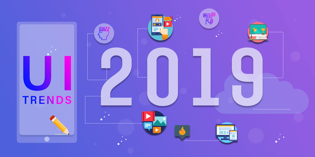
The Top 5 Design Trends to Watch Out for in 2019
Happy New Year, everyone! I hope you all had a spectacular year filled with love and laughter. To start off this year, we wanted to share some insight and inspiration with you guys, our readers.
GreatLike Media is an Orange County web design and digital marketing firm, and we love to provide users with all the new trends.
In this article, we’re going to talk you through the top 5 design strategies and trends to watch out for in 2019 from a millennial’s point of view.
Movement: Animation and GIFs
If you haven’t already heard, there has been a lot of buzz around the topic of microinteractions. Essentially, microinteractions are tiny animations used to communicate with users and help them perform tasks. They improve the user experience (UX), and are possibly one of the biggest design trends up to date.
Microinteractions are everywhere you look, and even though you may not be consciously aware of them, every time you receive any type of notification, swipe left on Tinder, like a picture on Instagram or provide feedback in any way, you are engaging with microinteractions. They are particularly useful in making users feel like they are in control or manipulating an interface by providing feedback by their actions and clicks.
When it comes to larger microinteractions, GIFs and SVGs are better tools for communicating ideas, concepts and processes while making content more engaging for users. GIFs add interest to ads, email newsletters, illustrations, icons, and logos, and have become a trend of their own.
Bold Typography
In typography, there is something called contrast. Contrast is important because it is one of the four elements of design strategy, and the human eye is naturally drawn to contrast. If you put two elements on the page that are not the same, they cannot be too similar. In order for contrast to be effective, the two elements must be extremely different. E.g. matching wall paint when you need to cover a ding. You either match the color, or you don’t.
When it comes to typography, you’ll find that the bigger and bolder, the better. This is because the bigger your letters/symbols/designs are, the more contrast is created within the page. Designers will be opting for artistic effects, extra-large font sizes and huge headlines. It is important to use eccentric fonts because that way, readers will be more engaged and intrigued. Typically, decorative and hand-made fonts grab attention quicker, so when designing a page, it is important to use fun and decorative fonts over boring serif fonts.
Digitized Handmade Art
Studies show that custom/handmade art appeals more to audiences. Naturally, people engage more when the work on a website is more personalized, because it makes audiences feel more involved/cared about.
With new tools like tablets, stylos, Adobe Creative Cloud and more, it is becoming easier to use hand-drawn designs to merge with digital pieces. The days of ‘old brushes in Photoshop’ are officially over because of the fast pace that the design industry is growing at. Digital paint brushing, a new design trend, is more versatile and utilizes more dimensions and ultimately gives off a more modern and aesthetic vibe.
Vivid and Bright Colors
Color is one of the most important aspects of design. Color draws attentions, sets a mood, and influences users’ emotions, perceptions, and actions. 90% of our assessment of a product is made on color alone, so it makes sense that color should be considered with care for every design decision, particularly on websites. Remember that once you choose colors for your brand, logo, headline, etc., it must be repeated to emphasize the design strategy of repetition.
Vibrant colors stands out from the background and adds energy to a design. Designers use vibrant colors to make people focus their attention on important elements and key features on a page. Altogether, it is important to utilize color when designing a page because it can be the sole reason a person clicks on your webpage.
Dynamic Gradients
Gradients have always been a hot topic of conversation in the design industry, but in the year of 2019, there will be a gradient comeback!
In computer graphics, a color gradient (also known as a “color ramp” or “color progression”) specifies a range of position-dependent colors, usually used to fill a region. For example, many window managers allow the screen background to be specified as a gradient.
The last time gradients were around, there were seen mainly in the form of subtle shading to suggest 3D dimensions (e.g. Apple’s iOS icons). Now, gradients are big, loud, and full of color and life. The most popular use is a gradient filter over photos, which serves as a great way to make a less interesting image look intriguing. Additionally, a simple gradient background can also be the perfect on-trend solution if you don’t have any other images to work with.
Hope you enjoyed this rundown of the top design trends of 2019 with our web design Orange County experts at GreatLike Media. What are your favorite design trends? Comment below!