April 18, 2016
What Is Responsive Design and How It Benefits Your Website
Now more than ever we are often on multiple devices at once. We could be watching Netflix while also reading Yahoo News on our iPad, and receiving texts on our phone. As a business owner with an active website, it can be difficult to remain consistent in the quality of your website in all devices. This is where responsive design comes in.
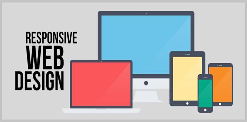
Responsive design is an underlying base of a website’s deployment that uses flexible grids, fluid images, and CSS3 media queries to adapt to viewer’s different device widths and resolutions. In short, responsive design is to have one site with different elements that help it move gracefully through a tablet, mobile device, or desktop.
In the past, creating a new site from scratch for every device was very common, but with responsive design that is no longer an issue. Here are some pros on how responsive design can help you created by our Orange County web design experts at GreatLike Media:
Cost Effective
Paying to build one website is substantially lower than paying to build 2 or 3. The average web site costs around $4,000 – $5,000 to build. Having a responsive design can help you save thousands of dollars.
Better SEO
Google recommends responsive design as the best practice for a seamless transition between digital platforms. Not only are your campaigns easier to manage with one site, it also allows Google crawlers to navigate through the site better.
Easy to Manage
The campaigns you create will be synced and you will not have to manage 2-3 different sites, thus saving you time.
Better User Experience
Responsive design is created to enhance the user’s experience when they are navigating through their different devices.
These are only 4 of the many benefits of responsive web design. Need more benefits or want a free quote for your website? Contact our Orange County web design experts at GreatLike Media today!
 Back to main posts